Monday, June 24, 2013

Ways to Display Scherenschnitte

      There is more than one way to display Scherenshnitte or paper cuts. Traditionally scherenshnitte have been preserved either in old scrapbook collections, under glass in traditional frames for display or as ornamentation for holidays. I have linked to a few interesting articles that my visitors can look at in order to get some less traditional ideas about how they might display their own designs here.

Framing scherenschnitte in untraditional ways.
Anatassia Elias displays her unique paper cuts inside paper toilet tubes.

Sunday, June 23, 2013

Illuminate Your Initial

Initials by English Illuminators, 12th and 13th Century.
      Art historians classify illuminated manuscripts into their historic periods and types, including (but not limited to) Late Antique, Insular, Carolingian manuscripts, Ottonian manuscripts, Romanesque manuscripts, Gothic manuscripts, and Renaissance manuscripts. There are a few examples from later periods. The type of book that was most often heavily and richly illuminated, sometimes known as a "display book", varied between periods. In the first millennium, these were most likely to be Gospel Books. The Romanesque period saw the creation of many huge illuminated complete Bibles – one in Sweden requires three librarians to lift it. Many Psalters were also heavily illuminated in both this and the Gothic period. Single cards or posters of vellum, leather or paper were in wider circulation with short stories or legends on them about the lives of saints, chivalry knights or other mythological figures, even criminal, social or miraculous occurrences; popular events much freely used by story tellers and itinerant actors to support their plays. Finally, the Book of Hours, very commonly the personal devotional book of a wealthy layperson, was often richly illuminated in the Gothic period. Other books, both liturgical and not, continued to be illuminated at all periods. The Byzantine world also continued to produce manuscripts in its own style, versions of which spread to other Orthodox and Eastern Christian areas. See Medieval art for other regions, periods and types. Reusing parchments by scraping the surface and reusing them was a common practice; the traces often left behind of the original text are known as palimpsests.
      The Muslim World and in particular the Iberian Peninsula, with their traditions of literacy uninterrupted by the Middle Ages, were instrumental in delivering ancient classic works to the growing intellectual circles and universities of Western Europe all through the 1100s, as books were produced there in large numbers and on paper for the first time in Europe, and with them full treatises on the sciences, especially astrology and medicine where illumination was required to have profuse and accurate representations with the text.
      The Gothic period, which generally saw an increase in the production of these beautiful artifacts, also saw more secular works such as chronicles and works of literature illuminated. Wealthy people began to build up personal libraries; Philip the Bold probably had the largest personal library of his time in the mid-15th century, is estimated to have had about 600 illuminated manuscripts, whilst a number of his friends and relations had several dozen.
Initial letters from French manuscript, 15 Century.
      Up to the twelfth century, most manuscripts were produced in monasteries in order to add to the library or after receiving a commission from a wealthy patron. Larger monasteries often contained separate areas for the monks who specialized in the production of manuscripts called a scriptorium. Within the walls of a scriptorium were individualized areas where a monk could sit and work on a manuscript without being disturbed by his fellow brethren. If no scriptorium was available, then “separate little rooms were assigned to book copying; they were situated in such a way that each scribe had to himself a window open to the cloister walk.” The separation of these monks from the rest of the cloister indicates just how revered these monks were within their society.
      By the fourteenth century, the cloisters of monks writing in the scriptorium had almost fully given way to commercial urban scriptoria, especially in Paris, Rome and the Netherlands. While the process of creating an illuminated manuscript did not change, the move from monasteries to commercial settings was a radical step. Demand for manuscripts grew to an extent that the Monastic libraries were unable to meet with the demand, and began employing secular scribes and illuminators. These individuals often lived close to the monastery and, in certain instances, dressed as monks whenever they entered the monastery, but were allowed to leave at the end of the day. In reality, illuminators were often well known and acclaimed and many of their identities have survived.
      First, the manuscript was “sent to the rubricator, who added (in red or other colors) the titles, headlines, the initials of chapters and sections, the notes and so on; and then – if the book was to be illustrated – it was sent to the illuminator.” In the case of manuscripts that were sold commercially, the writing would “undoubtedly have been discussed initially between the patron and the scribe (or the scribe’s agent,) but by the time that the written gathering were sent off to the illuminator there was no longer any scope for innovation.”

Practice coloring this large illuminated "M" from the 12th Century. Use a variety of ink pens, gel pens and metallic inks to decorate the narrow, delicate design work.
Have young students draw a large grid and then fill in each square space with one of their initials. Then encourage them to decorate each similar square with a repeating pattern. In this lesson they can learn about patterns, symbols, shapes, color and division.
 View Illuminated Manuscripts:
Illuminated Manuscript Resource Online:
 Modern Illuminated Manuscripts:

Saturday, June 15, 2013

Miniature Paper Kitchen Furnishings for Your Paper Dolls

      Three pieces of kitchen furniture for paper dolls from 1911 are being published this week. You may color them before cutting them out, according to your own taste, but naturally the stove should be dark gray or black. The other two pieces are a table and a chair, which will look well if colored yellow or white and blue. The table may have a white top with blue supports.
      Paste the entire sheet of furniture on letter paper so that the different pieces will be stiff enough to stand up. Then cut out each piece neatly by the arrows. Cut the straight slits, which you see, into which are to be thrust the tabs. The slits are most easily cut with a knife. When this has been done thrust the tabs through these slits and paste them down.
      If you did not make the box apartment as described in this series of publications, you may wish to display the pieces in a separate cardboard display measuring at least eight inches long, seven inches wide-and four inches high. the floor may be stained a dark brown or painted yellow, which is a good color for a kitchen floor of during the time for which the furniture designs were common in an American home. The walls may be colored in any tint that you prefer. The floor may have a square or oval of colored paper pasted in the middle of the floor representing a rug. Cut a window in one wall and a door in another and take one of the long walls away and the top off, as then the furniture will be more easily placed and the scene conveniently played with.

Designing Doll House Interiors:

Friday, June 14, 2013

Buster Brown and Tige at Dinner

      Cut around the outline, cutting the X; also cut the outline of the table pieces and bend up. Bend up the figures and paste laps to corners and the table is complete.

Thursday, June 13, 2013

Alien Name Cursive Exercise

      Cursive, also known as script, joined-up writing, joint writing, running writing, or handwriting is any style of penmanship in which the symbols of the language are written in a conjoined and/or flowing manner, generally for the purpose of making writing faster. However, not all cursive copybooks join all letters. Formal cursive is generally joined, but casual cursive is a combination of joins and pen lifts. In the Arabic, Latin, and Cyrillic alphabets, many or all letters in a word are connected, sometimes making a word one single complex stroke.
      While the terms cursive or script are popular in the United States for describing this style of writing the Latin script, this term is rarely used elsewhere. Joined-up writing is more popular in the United Kingdom, Ireland and Australia. The term handwriting is common in the United States, United Kingdom, Ireland, Canada, Australia and New Zealand.
      Cursive is considered distinct from printscript, in which the letters of a word are unconnected and in Roman/Gothic letterform rather than joined-up script. Printscript is also commonly called "manuscript", "block letter", "print writing", "block writing" (and sometimes simply "print" which confusingly also refers to mechanical printing).
      A distinction is also made between cursive and "italic" penmanship, in which some ascenders and descenders of cursive have loops which provide for joins and italic which is derived from chancery cursive, which mostly uses non-looped joins or no joins. There are no joins from g, j, q or y, and a few other joins are discouraged. Italic penmanship became popular in the 15th century Italian Renaissance. The term "italic" as it relates to handwriting is not to be confused with typed letters that slant forward. Many, but not all letters in the handwriting of the Renaissance were joined, as they are today in italic.
      In Hebrew cursive and Roman cursive, the letters are not connected. In the research domain of handwriting recognition, this writing style is called connected cursive, to indicate the difference between the phenomenon of italic and sloppy appearance of individual letters (cursive) and the phenomenon of connecting strokes between letters, i. e., a letter-to-letter transition without a pen lift (connected cursive).
      The origin of the cursive method is associated with practical advantages of writing speed and infrequent pen lifting to accommodate the limitations of the quill. Quills are fragile, easily broken, and will spatter unless used properly. Steel dip pens followed quills; they were sturdier, but still had some limitations. The individuality of the provenance of a document was a factor also, as opposed to machine font.
      In the following exercise, students write their first or middle names in cursive across a folded 8 1/2 x 11inch, white piece of typing paper. They may use a pencil to start with and then trace over their name with a black marker. Then allow them to turn their paper over and trace their cursive name on the back side of the folded paper in order to shape an "alien" outline. They will need to do this tracing either on a light table or a window. Students may then spin their names around and decide which vertical application will look best as an alien.

The names, Natalie and Hannah written in cursive.
The finished aliens found in the girls' names. Add fins, tails, teeth, antenna, and giant eyeballs to decorate your cursive alien names.
More Alien Name Art Lessons:

Mr. Roger's Neighborhood Resources

      Mister Rogers' Neighborhood (often shortened to simply Mister Rogers) is an American children's television series that was created and hosted by namesake Fred Rogers. The series originated in 1963 as "Misterogers" on CBC (Canadian Broadcasting Corporation) television and was later debuted in 1966 as Mister Rogers' Neighborhood on EEN, followed by its US network debut on February 19, 1968, and it aired on NET and its successor, PBS, until August 31, 2001. The series is aimed primarily at preschool ages 2 to 5, but has been stated by PBS as "appropriate for all ages". Mister Rogers' Neighborhood was produced by Pittsburgh, Pennsylvania, USA public broadcaster WQED and Rogers' non-profit production company Family Communications, Inc.; previously known as Small World Enterprises prior to 1971, the company was renamed The Fred Rogers Company after Rogers' death. Read more . . .

About Mr. Rogers General Media:
Activities & Lesson Plans Inspired by 'Mr. Roger's Nieghborhood': 
Reviews & Books:

Saturday, June 1, 2013

What's In a Name?

      A given name, in Western contexts often referred to as a first name, is a personal name that specifies and differentiates between members of a group of individuals, especially in a family, all of whose members usually share the same family name (surname). A given name is purposefully given, usually by a child's parents at or near birth, in contrast to an inherited one such as a family name. A given name is sometimes legally changed through a name change.
      Given names are often used in a familiar and friendly manner in informal situations. In more formal situations the surname is used instead, unless it is necessary to distinguish between people with the same surname. The idiom "on a first-name basis" (or "on first-name terms") alludes to the familiarity of addressing another by a given name.
      The western style of having both a family name (surname) and a given name is far from universal. In many countries it is common for ordinary people to have only one name (a mononym).
      In most European (and Europe-derived) cultures, the given name usually comes before the family name (though generally not in lists and catalogs), and so is known as a forename or first name; but the family name traditionally comes first in Hungary, parts of Africa and most of East Asia (e.g., China, Japan, Korea and Vietnam). In China and Korea, even part of the given name may be shared among all members of a given generation in a family and the family's extensions, to differentiate those generations from other generations.
      Under the common Western naming convention, people generally have one or more forenames (either given or acquired). If more than one, there is usually a main forename (for everyday use) and one or more supplementary forenames; but sometimes two or more carry equal weight. Beyond preceding the surname there is no particular ordering rule for forenames. Often the main forename is at the beginning, resulting in a first name and one or more middle names, but other arrangements are quite common.
      The term Christian name is often used as a general synonym for given name. Strictly speaking, the term applies to a name formally given to a child at an infant baptism or "christening".
       I've included below a handful of decorated names by young students in the school where I work. An introduction to illuminated manuscripts usually proceeds this kind of an art project. These decorated names were drawn by second graders.

Addie.
Alexis.
Leo.
Olivia.
Carlos.
Sarah.
Aetani.
Erica.
Riley.
Losan.
Atharv.
Bronte.

The Alphabet 100 Ways

  1. Search my pinboard - "Alphabet Themes for Early Learning Centers" if you are looking for teaching the ABC's to young children
  2. Papercraft alphabet
  3. Creative Exercise: Make a Zentangle Inspirational Text
  4. Michael Draws 3D Block Letters in one point perspective by www.drawingteachers.com
  5. Max and Gaby's Alphabet, By tony fitzpatrick
  6. Graffiti Diplomacy
  7. DKDrawing Graffiti "Daniel
  8. Alphabet100 by Christopher Rouleau
  9. Draw Autobiography Maps by Ms Lopez
  10. Lessons in Calligraphy and Penmanship
  11. An Interview With Timothy R. Botts
  12. monochromatic, complementary and analogous letters by James Hallam
  13. Comic Book Art...cont. at Splish Splash Splatter
  14. Sesame Street Song by Patti Labelle and Abc Hip Hop With Miles
  15. alphabets from Sue Doodles
  16. Word Animals from themetapicture.com
  17. Jasper Johns Style Painting from Denver 6-12
  18. Alphabet Activity by FrecklePhoto
  19. LOVE in watercolor
  20. Calligraphy Blackletter by Ted Mayhall
  21. Graffiti from schooart.weebly.com
  22. Positive Negative Space Mash-Up: Warm and Cool Colors
  23. The online graffiti creator
  24. LOVEHATE print
  25. very cute monster letters
  26. Personalized Name Art
  27. 15 Creative Typography Art Designs 
  28. The Saint John's Bible and A Modern Vision through Medieval Methods
  29. Graffiti: Art or Vandalism?
  30. Alphabet from artnau
  31. Name Tangles from The Bees Knees Cousin
  32. Our Wish for the World
  33. 22 of the world's most creative alphabets and the updated version here
  34. Word Foto App Art
  35. A chalkboard cover tutorial from Julie Fei-Fan
  36. Identity
  37. Abstract Name Designs - Finished!
  38. DIY Photo Name Art
  39. Educational Leadership
  40. Doodle Letters by Laura Stoner
  41. Photoshop CS4: A Picture Worth a Thousand Words
  42. Yeah No Yeah artwork by Grace Bonney
  43. nature themed alphabet blocks and Unusual Alphabet Blocks
  44. Graffiti Coloring Book by Uzi Wufc
  45. by Reuben Miller
  46. Color the Animal Alphabet
  47. Contour Lettering by Inky Alchemy
  48. Micrography Portraits from Mr. E.
  49. LOVE quilt by Quiltycat
  50. How to Make an Acrostic Book
  51. Tangled letters by students (in black and white) 
  52. 6 Great ABC Books
  53. Cursive Alphabet Print by Rachel Gilbert-Cornish
  54. Optical Illusion Mazes Using Letters
  55. paper + typography
  56. time flies
  57. Literal Art Papercuts 
  58. scribblers Calligraphy School
  59. Chinese Calligraphy
  60. Name Art at Artisan des Arts
  61. Mr. Moon Shining Bright Won't You Be My Muse Tonight...M is for Moon!
  62. A new perspective from ms art
  63. typo/graphic posters by daren newman
  64. Name Inside A Box
  65. Draw Ribbon Letters by Mr. MintArt
  66. Traditional Hebrew calligraphy swirls into cutting-edge font
  67. Name Skeletons
  68. Alphabet Letters Cursive Font Print by hatam
  69. Keynote from US Calligraphy Conference 2012
  70. Betsy Bowen Studio
  71. Onomatopoeia art
  72. How to do Custom Lettering Without a Fancy Machine
  73. The ABC's of Block Printing
  74. Personality Swirls
  75. Cross by Lisa Schulist
  76. Name Painting at Beijing China
  77. Wonky ABC I-Spy Quilt
  78. Amazing Art Alphabet
  79. Antique Samplers
  80. We Love Typography
  81. Illuminated Text Design (metallic paints on aluminum foil)
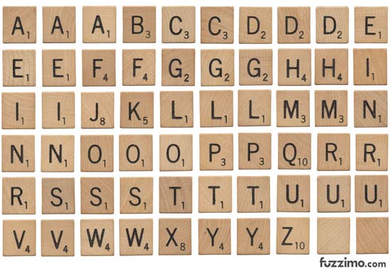
  82. wooden letter scrabble tiles
  83. Me and Mattisse
  84. Mary Kate McDevitt does hand lettering
  85. Poppy print by Martha Lever
  86. alphabet wall
  87. Back to School with Briana Johnson 
  88. Hudson King 
  89. How to Apply Gold Leaf
  90. Modern Alphabet Art
  91. Alphabet Posters
  92. Initial Designs
  93. How to Draw Graffiti Names
  94. The Alphabet Shelf by Lincoln Kayiwa
  95. Printable 3D Font
  96. Ideas from Diane Powers
  97. Lettering from AP students
  98. Entwined
  99. Ketubah Artists
  100. cursive alphabet table
  101. Alphabet Freaks
More Related Content:

 "How to Draw Graffiti Letters - Write Jacob in Cool Letters - Name Art, Cool letters, Jacob"